top of page
•Line graph: for continuous, independent variable
•Bar graph: to indicate frequency of unconnected categories; the independent variable is not numerical)
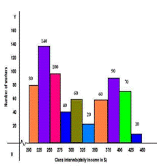
•Histogram: when the independent variable is numerical and continuous – put in categories or sections
•Pie chart: to present data as “parts of a whole” where the full circle represents the whole. Calculations are necessary to determine every section as part of 360
•Draw suitable graphs from own data
•Caption in which both variables are mentioned
•Independent variable on x-axis, dependent variable on y-axis.
•Axes must have labels and an indication of units.
•Suitable scale for graphs.
•Be accurate.


Bar graph

Bar graph
1/1
bottom of page


